
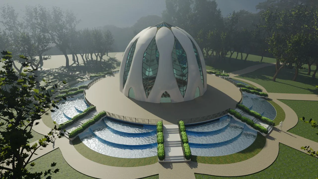
Some projects live entirely on screens. This one points at a building. My client was preparing a proposal for a temple design competition, a structure intended for construction in the coming years, and needed the design to exist as more than drawings. My part was to translate their architectural sketches into a 3D model that could carry the proposal.
It is also a different kind of pressure. A website ships and can be fixed tomorrow. A competition entry gets judged once, on what is in front of the jury that day, and the model is the argument.
I came to it from web work, where 3D models are built to survive phones and load fast. This project inverted every habit: no polygon budget worth worrying about, no compression pass at the end, just the question of whether the form itself was right. It was uncomfortable in the way useful things are.
Sketches are a direction, not a specification
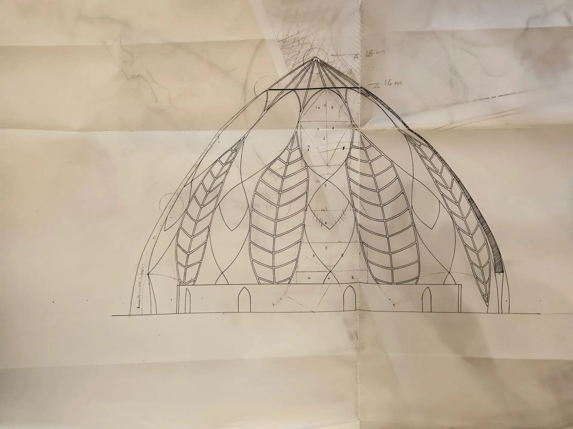
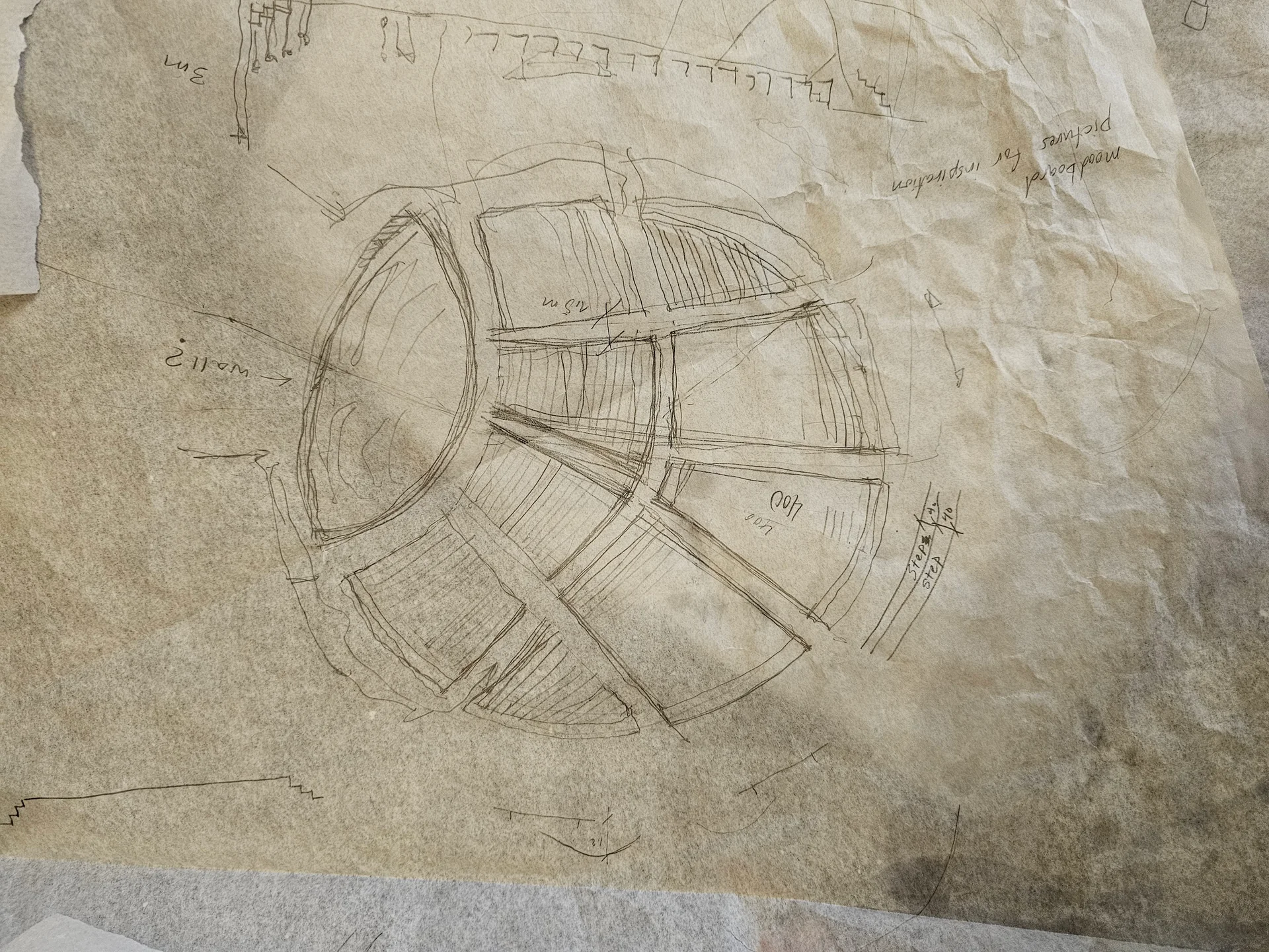
Working from hand-drawn sketches is a different discipline than working from CAD. A sketch gives you intent: silhouette, rhythm, the feeling of proportion. It does not give you dimensions that survive contact with 3D space. Curves that read beautifully on paper collapse when they meet symmetry, and details that feel minor in elevation become dominant in perspective.
The sketches themselves were good, which matters. A client who can draw gives you a real target: line weight tells you what they care about, repetition tells you what they are unsure of, and the drawings that arrive twice tell you where the heart of the design lives. Reading the drawings became as important as modeling from them.
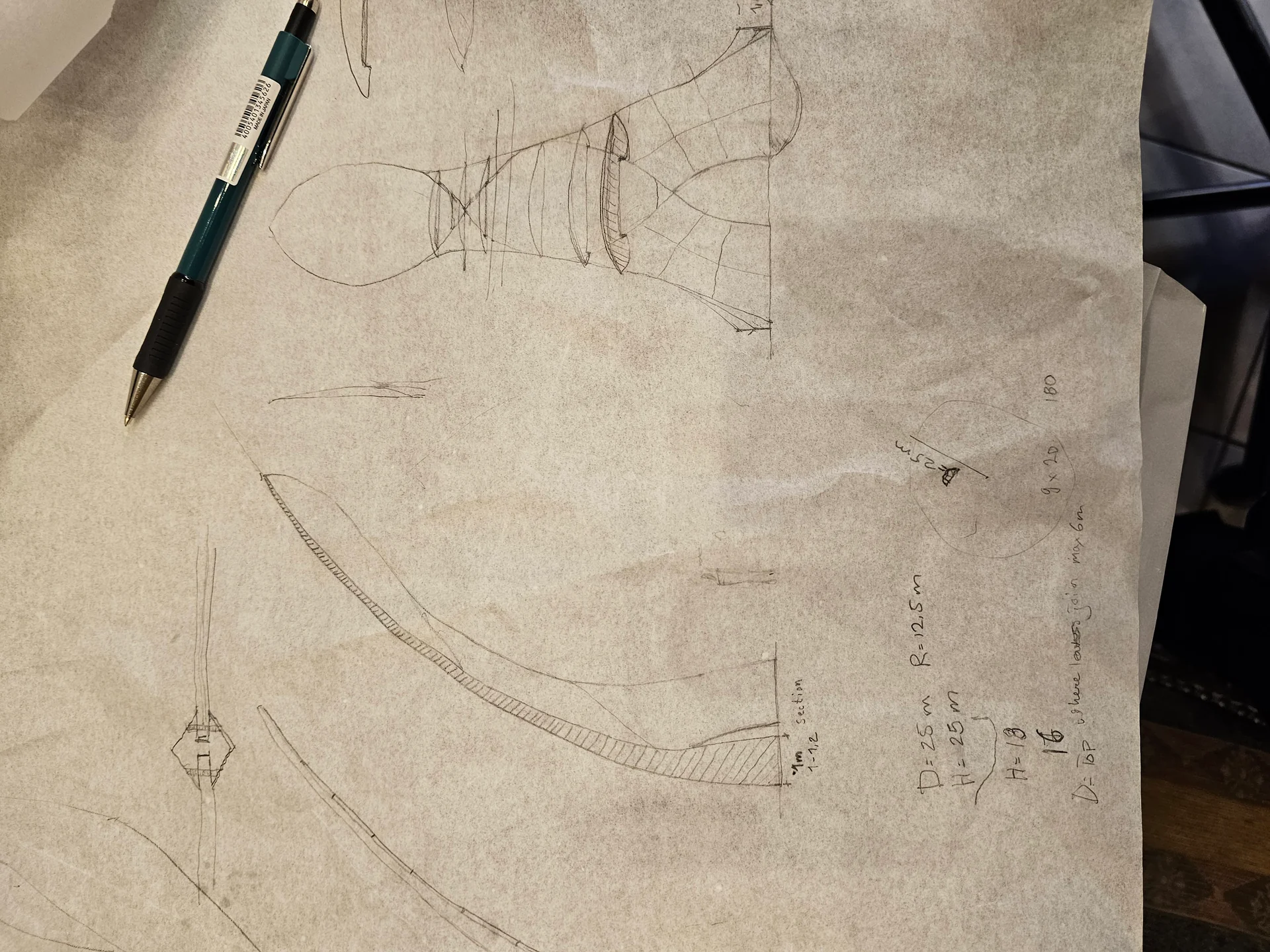
So the process became a conversation. Model, render, compare against the sketches, adjust. My client refined the drawings as the model revealed what worked, and the model followed the drawings in return. It took time, and it took many iterations, but each round moved the design somewhere neither the sketch nor the model could reach alone.
The working rhythm
We settled into a loop that repeated for weeks. My client would send annotated sketches, sometimes a full elevation, sometimes a correction drawn over one of my renders from the previous round. I would adjust the model, produce a new set of views from agreed camera positions, and send them back. Keeping the camera positions fixed between rounds mattered more than I expected: when only the architecture changes between two images, the conversation stays about the architecture.
Some rounds moved whole forms. Most moved centimeters. The dome profile alone went through more versions than I can honestly count, because a curve that reads right in elevation can feel heavy the moment you see it in perspective, and a temple lives or dies by its silhouette.
Between rounds I kept a short change log, one line per adjustment. It sounds bureaucratic for a creative project, and it saved us twice: once when a change needed reverting, and once when the client asked when exactly a proportion had drifted, and the log answered in seconds what memory would have argued about for days.
Modeling decisions that mattered
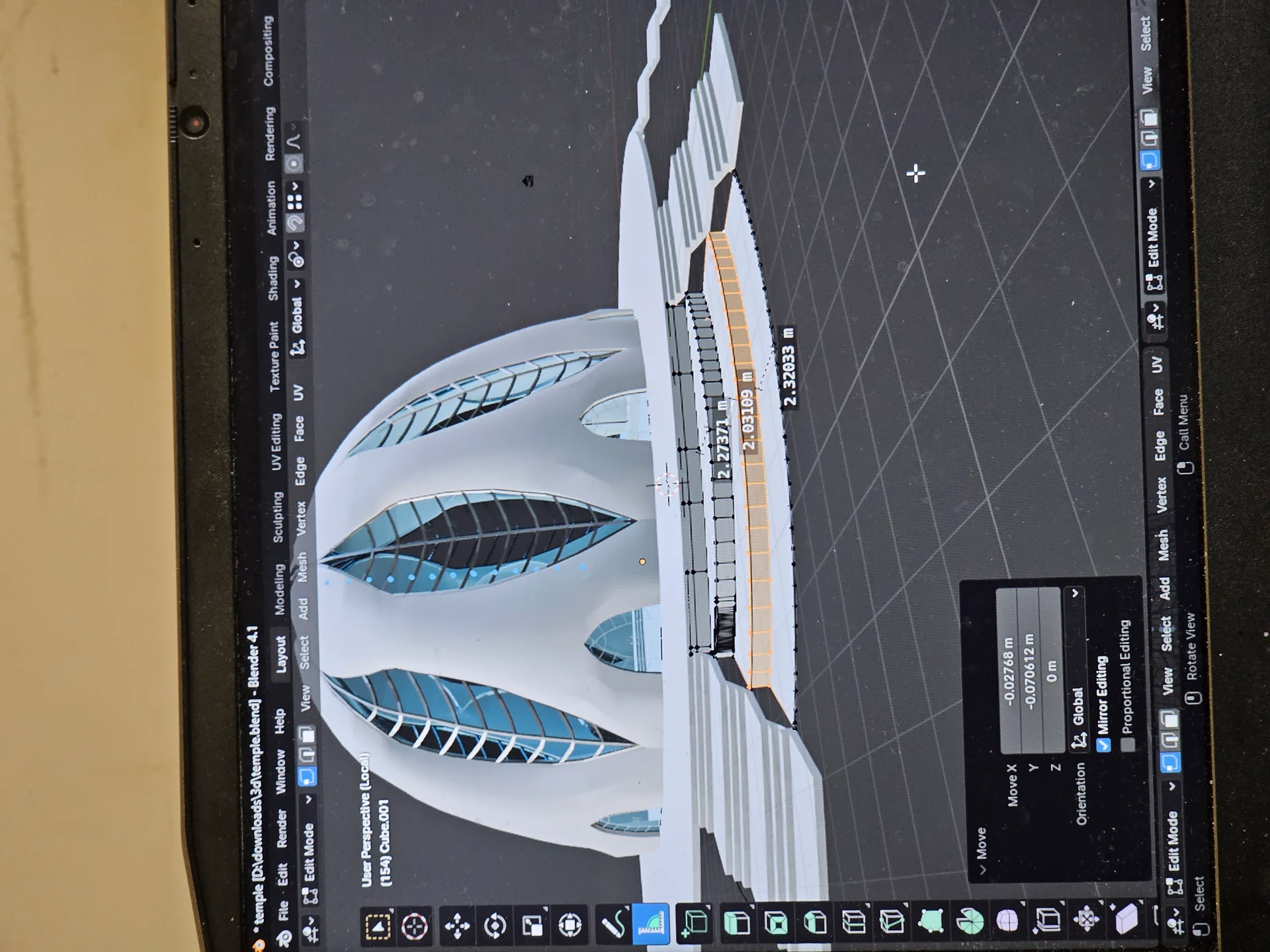
Radial symmetry became the quiet workhorse of the build. Model one segment properly, array it around the center, and every correction propagates to the whole structure at once. It kept the iteration loop fast, and it kept the geometry honest: any asymmetry would have read immediately as a mistake, in a building type where symmetry carries meaning.
Topology was the other constant decision. Competition renders forgive heavy geometry, so I could afford real curvature where it counted, but the model still needed structure: clean edge loops around openings, separate objects for elements that kept changing, modifiers left live for as long as possible so late adjustments stayed cheap. That discipline pays off the day the client asks to raise every arch by a hand's width, and the answer takes minutes instead of a day.
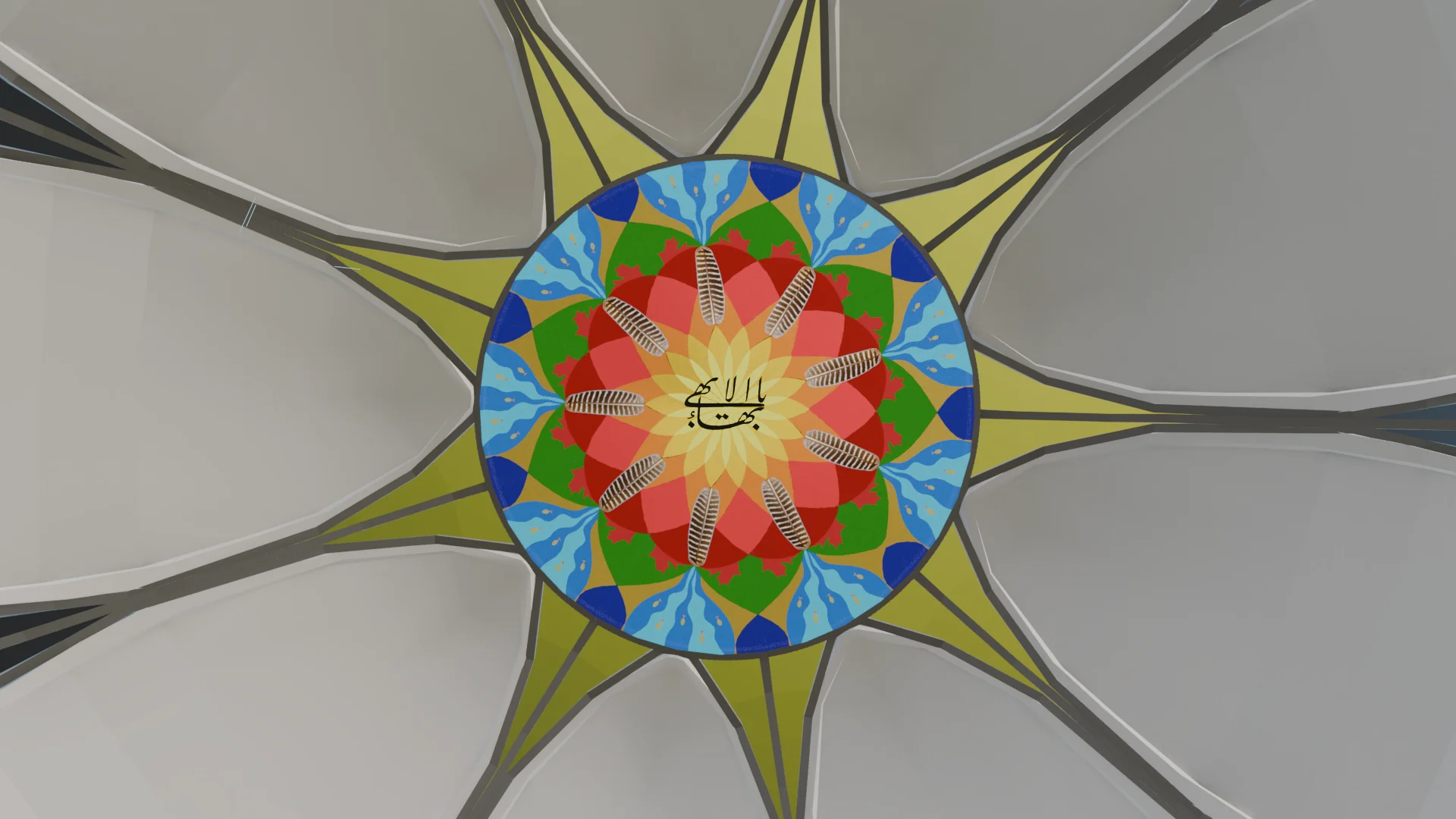
The glass was its own small project. Stained glass reads through transmission, so the panels needed actual thickness and honest material settings rather than a flat texture, otherwise the interior light would never behave the way the design intended.
The toolchain, briefly
Everything lived in Blender, modeled with a modifier-heavy workflow and rendered in Cycles, because a competition entry earns the patience of a path tracer. Real light transport is what makes stained glass believable, and believability was the entire assignment. Draft rounds rendered at low samples for speed, final boards at whatever quality the deadline allowed.
Reference gathering deserves its own mention. Built houses of worship in this tradition exist on several continents, each interpreting the same principles differently, and studying how those buildings handle light and approach informed dozens of small decisions in the model. Precedent is not copying. It is learning the questions the building type has already answered.
File discipline turned out to matter as much as any tool. Every round got its own numbered file, every camera its own named collection, and the annotated sketches lived beside the blend files so any decision could be traced back to the drawing that caused it. Months into a project like this, the archive is the only honest memory anyone has.
Light as a design tool
A temple is experienced as light as much as form. The stained glass interior became its own study: how color enters the space, how it moves across surfaces, what it does to the sense of stillness the architecture is reaching for. These renders did real work in the proposal, because they show what the drawings could only suggest.
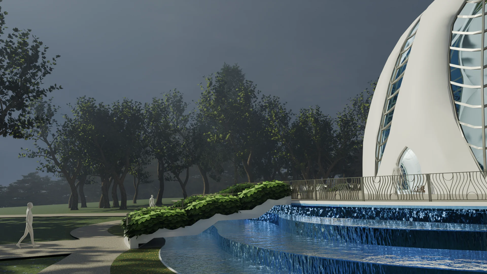
Rendering for a jury is closer to architectural photography than to product visualization. The camera stays near eye level, verticals stay vertical, and every frame answers a question a juror might actually ask: how does it sit against the sky, what does the approach feel like, what happens inside at midday. Spectacle angles impress other 3D artists. Eye level convinces committees.
Consistency across the board set matters just as much. Same lens, same sun angle family, same treatment of the sky, so the sequence of images reads as one building studied carefully rather than a collage of attempts. A jury reads dozens of proposals in a sitting. Coherence is a kindness, and kindness gets remembered.
The result
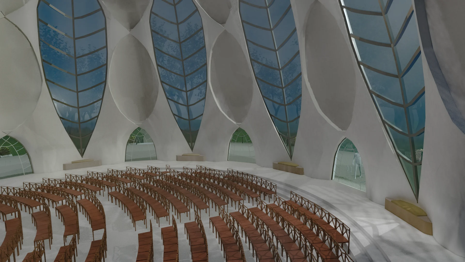
We reached a model that holds up from every angle the jury might take, and that stays true to the sketches it grew from. Whether the temple gets built is now in the hands of the competition, but the design exists, precisely, in space. There is something satisfying about 3D work that might one day cast a real shadow.
There is also an obvious next step waiting for this model. The same geometry, taken through the optimization pipeline I use for product work, could become an explorable web experience: walk the approach, stand in the interior light, understand the building from a browser. If the proposal advances, that is the version I want to build, and the model was constructed carefully enough to survive the conversion.
What a temple teaches you about websites
This project sits outside my usual work, and that is exactly why it improved it. Architecture enforces patience: nothing about a building rewards the quick effect, and every decision has to survive being looked at from all sides, for years. Carrying that mindset back into interactive work changed how I judge my own scenes. Fewer moves, held longer, built more carefully.
It also sharpened something I keep returning to: space communicates before language does. A temple does it with stone and light. A website does it with depth and motion. The grammar transfers, and I unpacked that side of it in The Semiotics of Digital Space.
More frames from this project are in the Bahai 3D case study.