
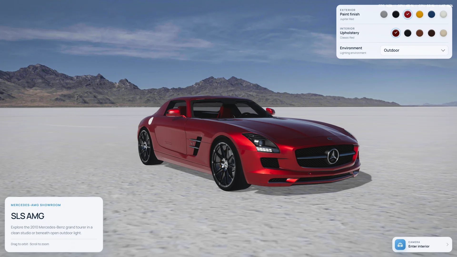
There is a version of automotive realism that looks convincing in a still and falls apart the moment you drag the camera.
The paint goes flat. Glass turns grey. Chrome starts looking like plastic. Then somebody chooses a bright color, moves into the cabin, or opens the same page on a phone, and the carefully art-directed image is gone.
A configurator has to survive all of that. It is not a render with controls placed on top. It is a small product system where the model, materials, light, camera, interface, and loading strategy all have to keep agreeing with each other.
I built the Mercedes-AMG SLS configurator as an independent concept study around that problem. It is not affiliated with or endorsed by Mercedes-Benz; the aim was to explore what a premium automotive showroom can feel like when it runs entirely in the browser.
Realism is not one setting
The tempting way to approach realism is to search for one big upgrade: a higher-resolution model, a stronger reflection pass, a better HDR, more samples. Those things can help, but realism usually comes from agreement. The highlight on the paint needs to match the light in the environment. The contact shadow needs to match the position of the car. Glass needs to reveal an interior that is lit as if it occupies the same space.
When those relationships line up, the scene feels expensive without becoming loud. When one of them is wrong, adding more effects mostly makes the disagreement sharper.
The model is the starting point, not the finished experience
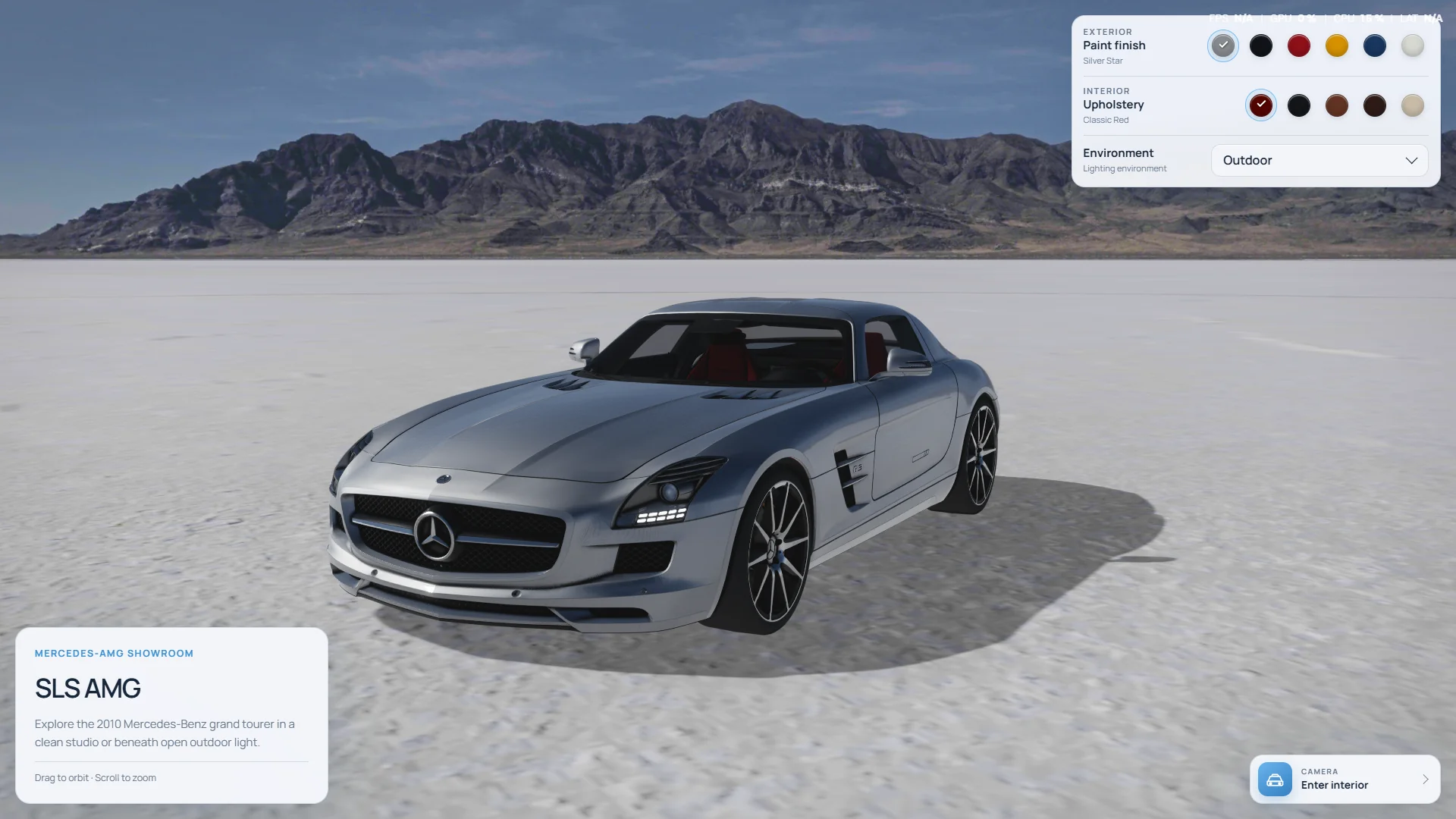
The vehicle arrives as a detailed glTF asset, but a correct model does not automatically become a good web product. The scene still needs predictable scale and orientation, useful material names, sensible bounds, clean camera framing, and a loading path that does not surprise the visitor.
The car file in this build is roughly 9 MB and uses Meshopt compression. That is detailed enough to hold the lamps, cockpit, wheels, grille, and bodywork at close range, but still small enough to be delivered as a real interactive asset. The decoder is self-hosted with the project, so the experience does not depend on a third-party CDN being available before the vehicle can appear.
For client work, this preparation stage is where a surprising amount of quality is won. A heavy manufacturing export can contain excellent shape data and still be the wrong asset for a browser. I covered that broader conversion process in From STL to glTF.
Paint has to survive more than one good angle
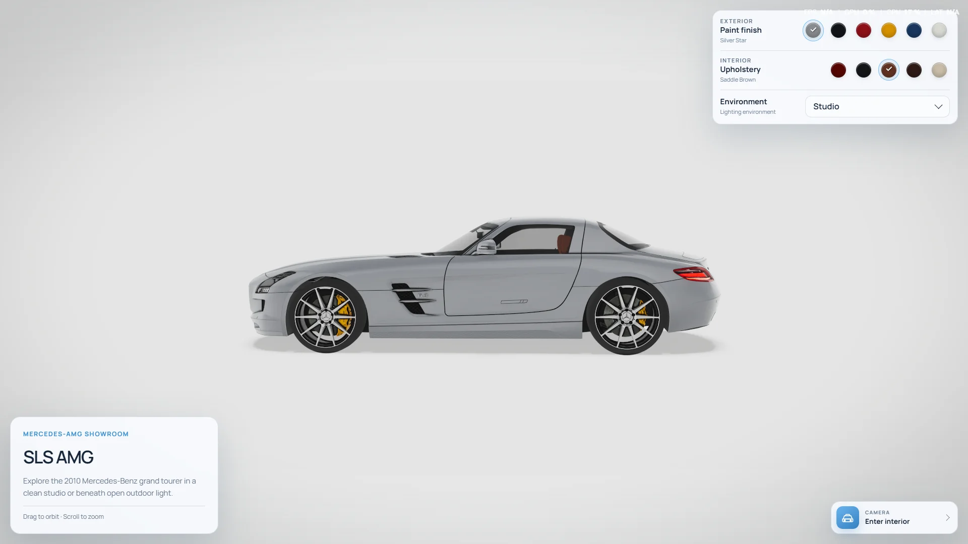
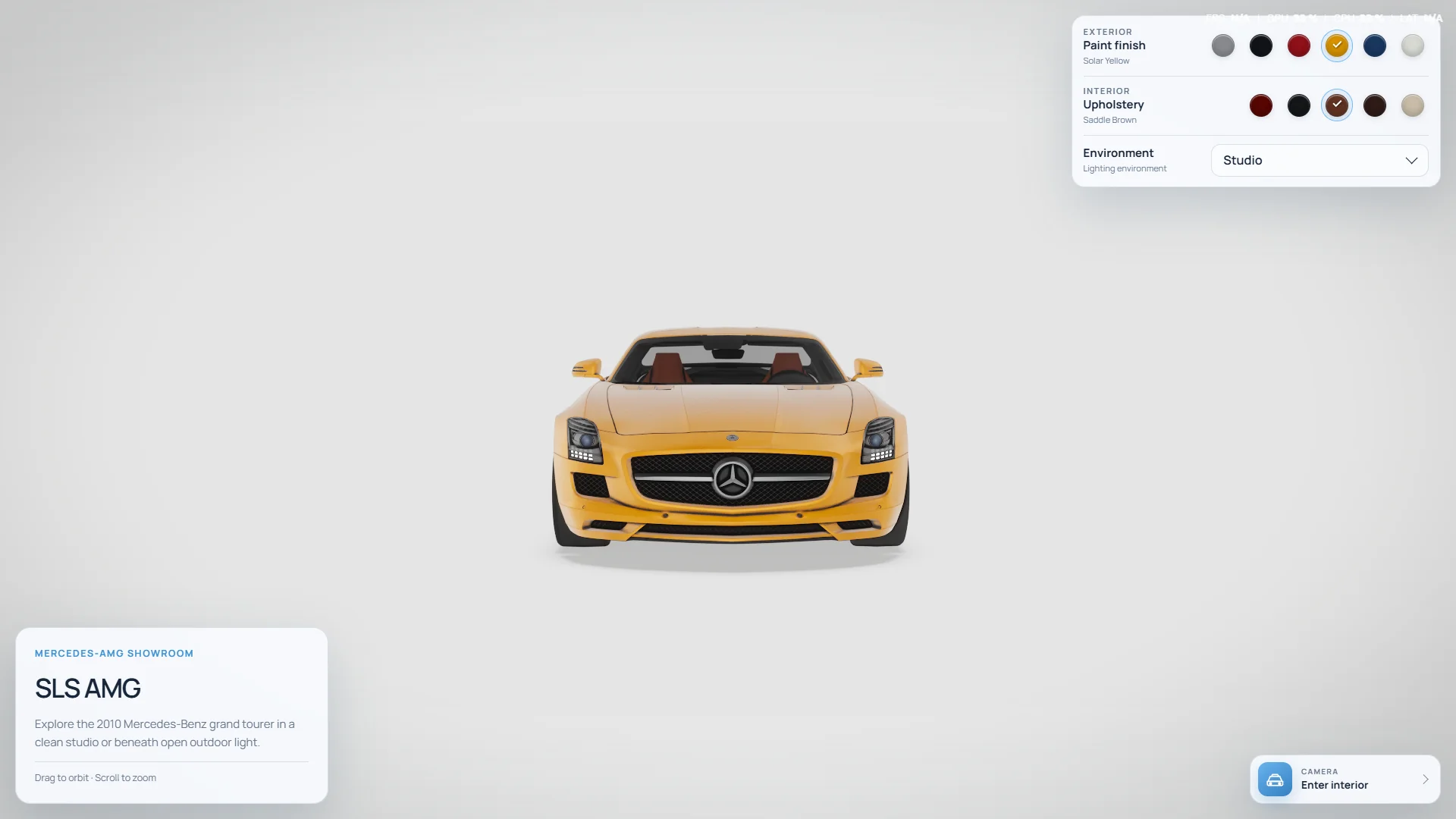
The configurator includes six exterior finishes, from Silver Star and Obsidian Black to Jupiter Red, Solar Yellow, Mystic Blue, and Designo White. Selecting one changes the body material in place. The authored texture detail, clearcoat, roughness, metalness, and reflection response remain intact.
That distinction matters. Replacing the whole material for every swatch is easy, but it also makes it easy for one option to lose a normal map or carry a different reflection intensity. Changing only the part that is actually being configured keeps every finish comparable. The customer is choosing a color, not choosing between six unrelated shaders.
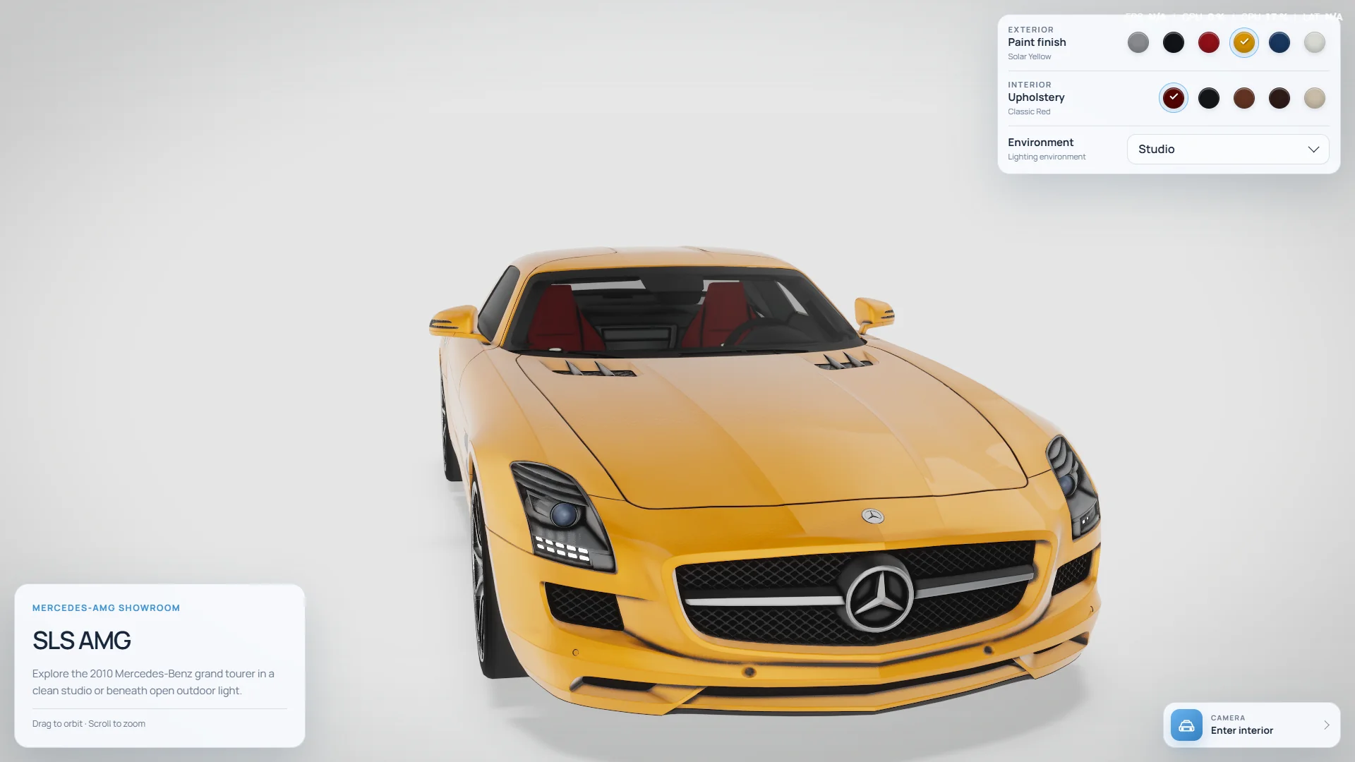
Bright yellow is the rude test. It reveals clipped highlights, dirty shadows, and overdone bloom immediately. Black is the opposite test: if the lighting is too flat, the silhouette disappears. I kept both in the set because a material pipeline that works only for silver is not really a configurator pipeline.
Light is part of the configuration
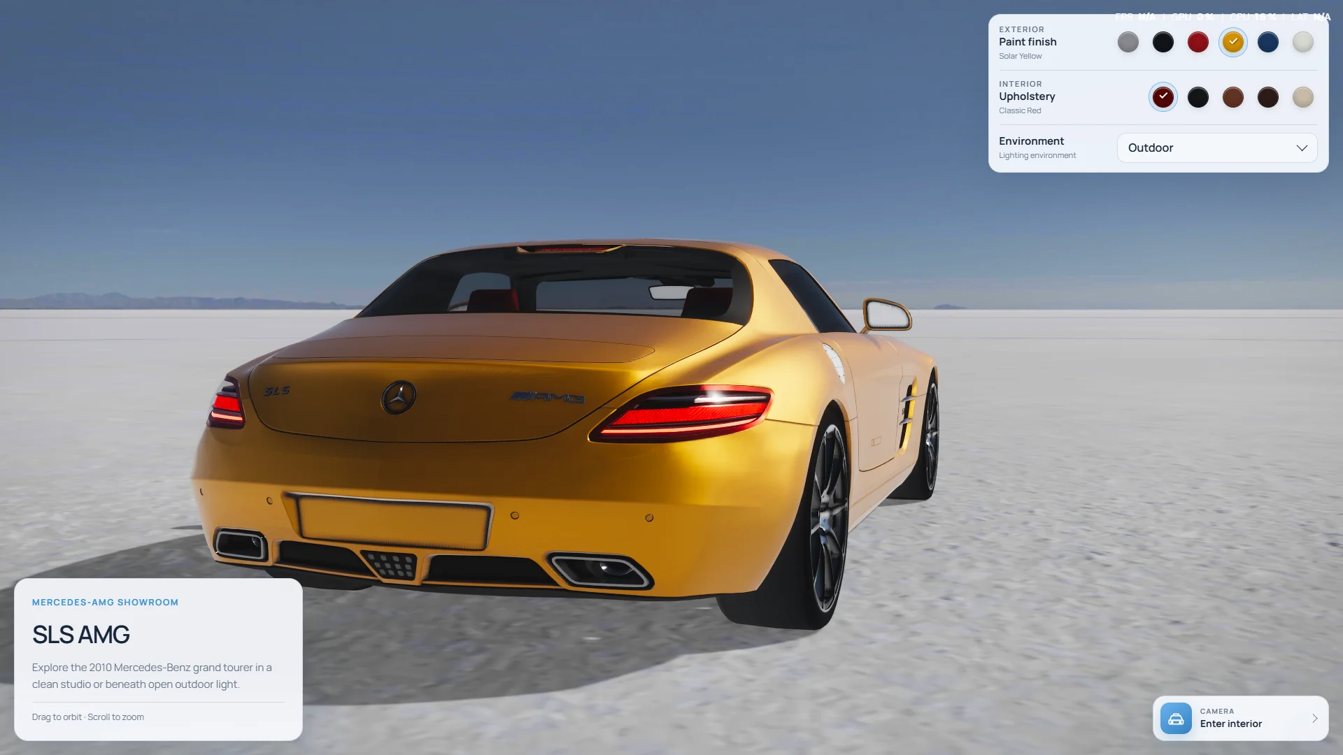
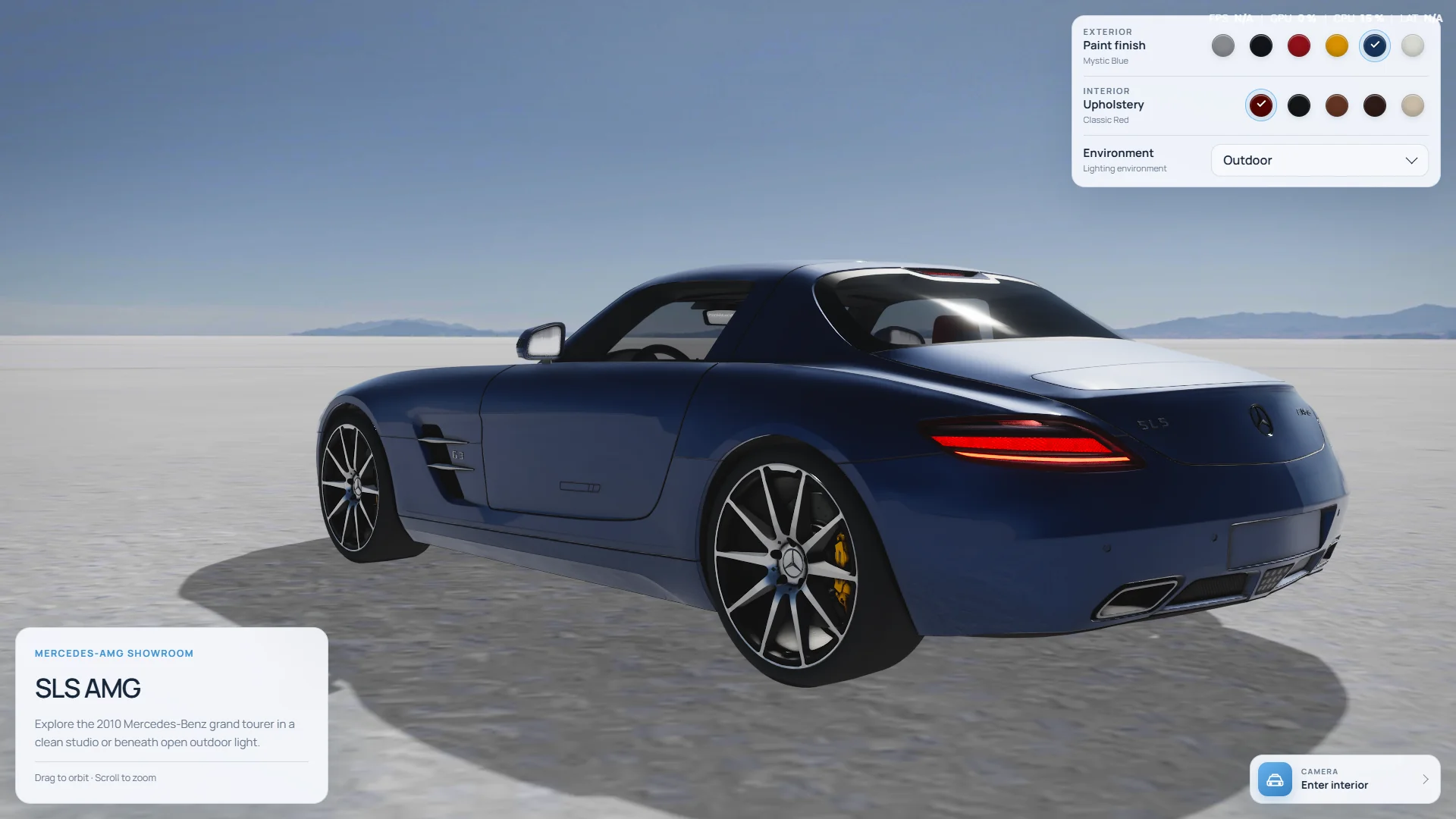
The experience has two environments because they answer two different questions. The white studio is for comparison. It gives the car a controlled, neutral surround where paint, wheels, panel gaps, and trim are easy to judge. The outdoor salt field is for character. A wide horizon and harder daylight create longer reflections and show how the same finish behaves away from the showroom.
The outdoor mode is more than a panoramic background. A projected environment scene supplies the visible landscape, an HDR image supplies the material lighting, and a measured directional setup keeps the ground shadow consistent with the bright side of the panorama. The studio uses a quieter image-based light-card setup and a dedicated soft footprint shadow.
For a real sales tool, this split is useful. A neutral mode supports comparison and approval. A contextual mode supports desire. Putting both in the same experience lets the customer move between those mindsets without losing their configuration.
The small material decisions do most of the work
Cars are difficult because almost every adjacent surface wants a different response. Body paint needs broad, clean highlights. Chrome needs sharper reflections. Rubber should stay rough. Carbon fibre needs detail without sparkling. Lamps need depth. Windows must reflect the environment while still letting the cabin exist behind them.
I used a ThreePipe and Three.js rendering pipeline with ACES filmic tone mapping, screen-space reflections, ambient occlusion, contact shadows, temporal antialiasing, progressive refinement, and a very restrained bloom pass. The list sounds dramatic. The final values are not. The job of the stack is to support the materials, not announce itself as post-processing.
- Clearcoat keeps the paint highlight separate from the color underneath it.
- Dedicated reflection treatment keeps windows readable without turning them into opaque grey panels.
- Ambient occlusion is limited around transparent cabin surfaces so it does not stamp a dark interior silhouette across the glass.
- Contact and footprint shadows give the tyres weight without making the ground look painted black.
- Temporal antialiasing and progressive frames settle fine grille, wheel, and lamp detail after camera movement stops.
The interior needs a different camera, not a closer zoom
An exterior orbit camera moves around an object. An interior camera should feel more like a person turning their head. Reusing the same controls inside a cabin usually means clipping through the roof, getting lost behind a seat, or zooming through geometry that should feel solid.
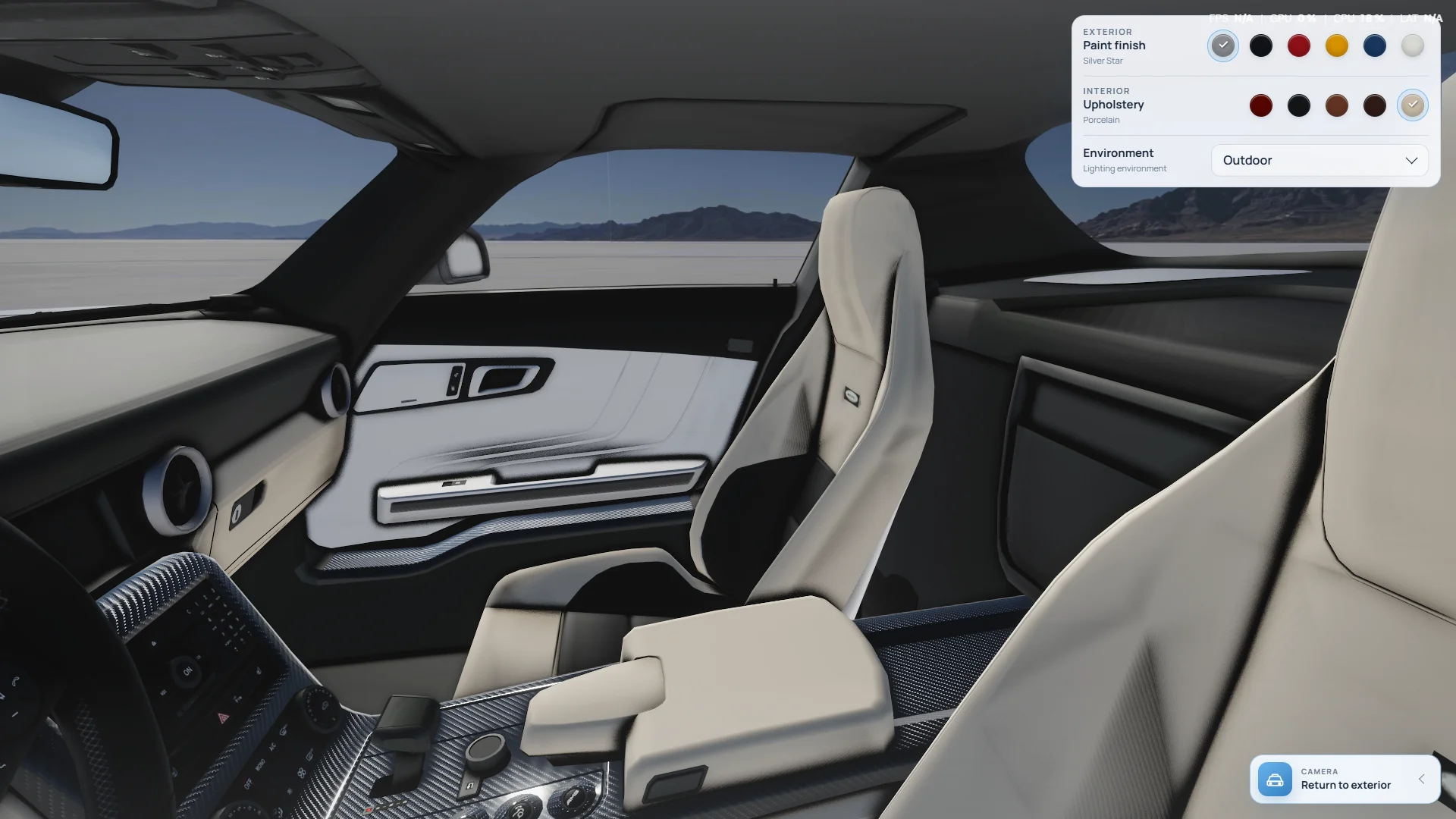
The Enter Interior action follows a directed path through the open side of the vehicle and settles at driver-eye height. Once inside, zoom is disabled, rotation is slower, and the orbit radius becomes very small. Returning to the exterior restores the angle the visitor had before entering, so inspecting the cabin does not reset the rest of the session.
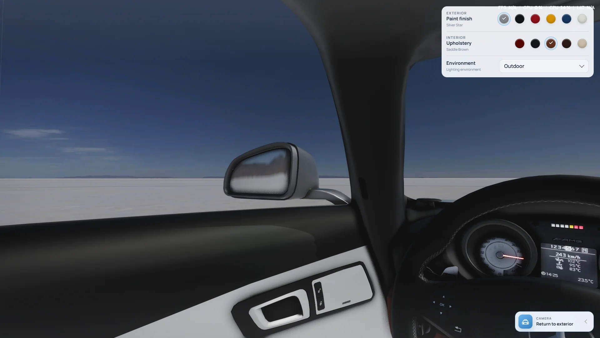
Five upholstery colors can be switched from either view. The change is scoped to the soft interior material, which means the displays, carbon fibre, brightwork, stitching detail, and glass keep their original response. Again, the useful rule is to change only what the customer chose.
The interface stays out of the photograph
A premium configurator does not need to look complicated to be capable. The desktop controls live in one corner: exterior color, upholstery, and environment. The model card occupies the opposite edge, and the interior action stays close to the place where the next decision happens. Most of the viewport is simply the car.
The controls are proper keyboard-operable radio groups and a custom select with live loading feedback. On mobile they fold into a compact summary panel, while the camera pulls back to account for the narrower horizontal field of view. Those details are less glamorous than reflections, but they are the difference between a visual demo and something a customer can actually use.
Realism also means waiting honestly
This is still a detailed vehicle, an environment model, an HDR, textures, and a rendering pipeline. Pretending it weighs nothing would not make the page faster. The experience uses a staged preloader tied to real asset progress, prepares the vehicle and environment in parallel, reuses already-convolved lighting between mode changes, and compiles the expensive environment state before handing control back.
Resolution scales with the device but has a ceiling. Progressive rendering adds quality after movement settles instead of paying the full price on every frame. These are practical compromises: keep the first interaction clear, spend detail where it can be seen, and avoid making a phone prove that it can render the same workload as a desktop monitor.
What I would carry into a client build
The useful outcome is not a Mercedes-shaped template. It is a process that can be adapted to another vehicle, furniture line, watch, appliance, or any product where finish and material matter. Start with the customer decision, prepare the asset around that decision, create lighting that makes the options comparable, and keep the interface quieter than the product.
- Define which choices genuinely need a live 3D comparison before building the control panel.
- Use one material system across every option so customers compare products rather than rendering inconsistencies.
- Include a neutral lighting context for accuracy and a branded context for emotion when both serve the sales journey.
- Treat close-up and interior viewpoints as directed camera states, not unrestricted navigation.
- Plan model weight, loading feedback, responsive controls, and fallback behavior as part of the product brief.
The result should feel simple from the customer side. Pick a finish. Step into the cabin. Move from studio light to open daylight. The complicated work stays underneath, which is exactly where it belongs.