
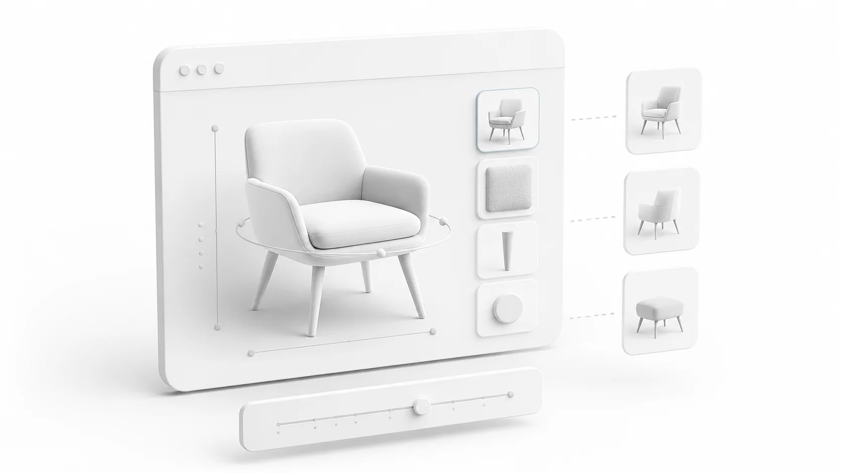
Over the years of working with clients, I started understanding something that sounds simple, but actually changes how you approach the whole project.
Client work is not just about building what sounds impressive. It is about putting yourself in the position of their customer and trying to look at the product through their reality.
What do they actually need to understand? What are they unsure about? What would make them feel more confident before buying? What would help the business get more conversions without making the experience confusing?
That is how I try to treat client projects.
Of course, it is never perfect from the first version. You usually get there through communication, iterations, testing different directions, and listening properly to what the client is actually trying to achieve.
A good example of this was one of the 3D configurator projects I worked on for Tenjam, a pool furniture brand from the US.
At the beginning, I explored a more cinematic direction. More atmosphere. More movement. More of an immersive product experience.

And I still think there is a place for that kind of approach, especially when the goal is brand presence, storytelling, or creating something people remember.

But after a few rounds of discussion and iteration, it became clear that this specific configurator had a more practical job.
The client did not need a dramatic product journey. Their customers needed to clearly understand which pool lounger setup made sense for their pool.

That meant questions like: What pool depth do I have? Which lounger works with that depth? Do I need risers? Do I need additional weights? Which product option is actually right for my situation?
Once that became clear, the direction of the configurator changed. The goal was no longer to make the most visually impressive version possible. The goal was to make the buying decision clearer.
That is an important difference. Because a 3D configurator can easily become just a nice interactive viewer. You load a model. You rotate it. You switch colors. You add some smooth animations. And visually, it may look good. But if the user leaves without understanding the product better, then the configurator did not really do its job.
For Tenjam, the useful part was not only showing the product in 3D. It was showing the product in the right context.
The water depth mattered. The riser height mattered. The product position in the pool mattered. The message around suitability mattered. The difference between "this looks nice" and "this is the right setup for my pool" mattered.
That is where the project became more interesting to me. Not just from the visual side, but from the product logic side.
A configurator should reduce uncertainty.
When someone is buying a physical product online, especially something connected to space, size, installation, comfort, or environment, they are usually not only looking at the design. They are trying to imagine it in their own life.
Will this fit? Will this look right? Will it work in my space? Am I choosing the right size? Will I regret this option later?
A good 3D configurator helps answer some of those questions before the customer needs to contact support, read too much text, or guess from static images.
That is why I think the first step is not the 3D model. The first step is understanding the decision. What decision is this tool helping the customer make?
For a furniture configurator, it might be size, material, color, room fit, or style. For a pool product, it might be water depth, riser height, and additional parts. For a carpet configurator, it might be dimensions, pattern, proportion, and how it feels inside a room. For a watch, it might be material, strap, finish, and how the object feels up close.
The technical solution should follow that decision.
That also changes how you think about the interface. The interface should not just show every possible option because the data exists. It should guide the user toward clarity.
Sometimes that means fewer controls. Sometimes it means better labels. Sometimes it means a simple slider instead of a complex menu. Sometimes it means showing a direct message like "this setup works better for this depth". That kind of detail can be more useful than another visual effect.
With Tenjam, I also learned how important it is to separate the product logic from the visual scene. Once you move from one configurator to multiple products, hardcoded logic becomes painful very fast.
Product names, model paths, finishes, riser options, dimensions, rules, thumbnails, labels, and suitability messages should live in structured data. The 3D scene should read that data and display the right result. That makes the configurator easier to maintain, easier to expand, and easier to adapt when the client changes something later.
And client changes are not an exception. They are part of the project. Product details change. Files get updated. Labels get rewritten. New options appear. Something that looked clear in the first demo becomes confusing after real review. So the project needs to be flexible enough for that.
That is also why live preview links are so useful. For this type of project, screenshots are not enough. A configurator is about interaction. The client needs to open it, test it, try it on mobile, click through the options, and see how it actually feels. That is when the useful feedback appears.
Not just "this looks good" or "make this nicer", but actual feedback like:
- this option should be clearer
- this message is confusing
- the customer needs to see this earlier
- this mobile layout is not comfortable
- this product state should be more obvious
That feedback is what shapes the final tool.
Another important part is performance. A 3D configurator is often used by people who are not sitting on a powerful desktop. They may open it on a phone, from a product page, from Instagram, from a message, or while talking with someone about the purchase. So it needs to be light enough to actually use.
The models need to be optimized. Textures need to be compressed. The first load needs to be reasonable. The scene should not load everything at once if it does not need to. The UI needs to be comfortable on mobile.
This part is not as exciting to show in a video, but it matters a lot. A slow configurator can hurt the same buying process it was supposed to improve.
The same goes for product assets. Clients often do not have perfect web-ready 3D files from the beginning. They may have CAD files, manufacturing files, heavy exports, missing materials, wrong scale, or geometry that works for production but not for real-time rendering.
So part of the work is turning those files into something that actually works in the browser. A model is not really ready when it opens in Blender. It is ready when it loads fast, looks correct, works on mobile, and does not make the experience feel heavy.
Looking back, the biggest lesson from projects like this is that a configurator sits between design, development, product understanding, and business goals. It is not just a visual feature. It is a decision-making tool.
The nice visuals are important. The interaction is important. The technical structure is important. But all of that should serve the same thing: helping the customer understand the product better and helping the business present it in a way that leads to a clearer decision.
That is why I try to think from the customer's perspective first. Not because the client's vision does not matter. It absolutely does. But because the client usually wants a result, not just an effect. More clarity. More confidence. More conversions. A stronger product experience. A better way for their customers to understand what they are buying.
Sometimes the boldest idea is the right one. Sometimes the simplest version is the right one. The important part is being honest enough during the process to see which one actually serves the project better.
For Tenjam, the right direction was a clear, practical configurator that helped users understand pool depth, product fit, riser needs, and additional setup options.
And that is exactly the kind of lesson I value from client work. The final result is not always about proving how much technology you can add. Sometimes it is about using just enough technology to make the customer's decision easier.